Mobile Friendly Website Design for Beginners
Creating a mobile friendly website design is no longer optional. With most Australians browsing, researching and buying directly from their phones, your website needs to load quickly, look clean and work smoothly on smaller screens.
The good news is that you do not need to be a designer or developer to get this right. With a few simple principles, you can build a website that feels modern, professional and easy to use on any device.
This guide breaks down the essentials of mobile‑friendly website design for beginners, with practical steps you can apply straight away.
Article Sections
- Why mobile‑friendly website design matters
- What makes a website mobile friendly
- Responsive website tips for beginners
- Common mobile design mistakes beginners should avoid
- How to optimise your website for mobile speed
- Mobile friendly content tips for small businesses
- How to test if your website is mobile friendly
- Final tips for creating a mobile friendly website design
Why mobile‑friendly website design matters
How mobile usage in Australia affects your website
Australians rely heavily on mobile devices for everyday tasks, from checking opening hours to booking appointments and comparing services. If your website is difficult to use on a phone, visitors will leave quickly and choose a competitor whose site is easier to navigate.
A mobile‑friendly design helps you stay competitive and ensures your business is accessible to customers wherever they are.
Why Google prioritises mobile‑friendly websites
Google uses mobile‑first indexing, which means it primarily evaluates the mobile version of your website when determining search rankings.

If your site is not mobile friendly, it may struggle to appear in search results, even if your desktop version looks great. A responsive design helps improve visibility and supports your overall SEO efforts.
The impact of poor mobile design on conversions and trust
A website that is slow, cluttered or hard to read on mobile can damage trust. Visitors may assume your business is outdated or unreliable.
On the other hand, a clean, responsive layout creates a positive first impression and makes it easier for customers to take action, whether that is calling, booking or buying.
What makes a website mobile friendly
Clear layouts that adapt to different screen sizes
A mobile friendly website design automatically adjusts its layout to fit the screen. This ensures your content remains readable and your design stays consistent across phones, tablets and desktops.
Easy‑to‑read text and simple content structure
Small screens require larger, more readable text. Short paragraphs, clear headings and generous spacing help visitors scan your content quickly.
Buttons and links that are easy to tap
Clickable elements need to be large enough to tap without zooming in. This improves usability and reduces frustration for mobile users.
Fast loading times on mobile networks
Mobile users expect quick results. Optimising your site for speed helps reduce bounce rates and improves the overall experience.
Navigation that works smoothly on smaller screens
Menus should be simple, intuitive and easy to open. A clean mobile menu helps visitors find what they need without confusion.

Responsive website tips for beginners
Choosing a responsive theme or template
The easiest way to create a mobile friendly website design is to start with a responsive theme or template.
Most modern website builders, including WordPress, Squarespace and Shopify, offer templates that automatically adjust to different screen sizes.
A good responsive theme should:
- resize text and images smoothly
- stack columns neatly on smaller screens
- include mobile‑friendly navigation
- avoid fixed‑width elements that break layouts
Choosing a well‑built template saves hours of manual adjustments and ensures your site looks consistent across devices from day one.
How to test your website on different devices
Testing is one of the most important responsive website tips for beginners. Even the best templates can behave differently depending on the device or browser.
You can test your site by:
- checking it on your own phone and tablet
- asking friends or colleagues to view it on their devices
- using your browser’s device preview mode
- rotating devices to check both portrait and landscape views
This helps you spot issues such as overlapping text, misaligned images or buttons that are too small to tap.
Using flexible images and media that resize correctly
Images play a major role in how your website looks and loads. Flexible images automatically scale to fit the screen without stretching or breaking the layout.
To keep your images responsive:
- upload them at an appropriate size
- use your builder’s responsive image settings
- avoid placing text inside images, as it may become unreadable on mobile
- ensure videos and embeds are set to scale rather than stay fixed
This keeps your site looking clean and professional on any device.
Avoiding design elements that break on mobile
Some design elements look great on desktop but cause problems on mobile. These include wide banners, complex animations, oversized sliders and multi‑column layouts.
Beginners often add too many visual elements, which can slow down the site and make it harder to use on smaller screens. Keeping your design simple helps maintain speed, clarity and usability.
A good rule of thumb is to ask whether each element adds real value. If it doesn’t, remove it.
Keeping your layout clean and uncluttered
Minimalist layouts tend to perform best on mobile because they reduce cognitive load and make it easier for visitors to find what they need.
A clean layout includes:
- clear spacing between sections
- short paragraphs
- simple colour schemes
- one main call to action per page
This approach helps guide visitors through your content without overwhelming them. It also improves loading times, which is essential for mobile users on slower networks.
Common mobile design mistakes beginners should avoid
Using text that is too small to read
One of the most common mobile design mistakes beginners make is using text that looks fine on a desktop but becomes tiny and unreadable on a phone. Mobile users should never have to pinch‑zoom just to read your content.
Readable text is essential for keeping visitors engaged. Larger font sizes, generous line spacing and clear contrast between text and background all help improve readability.
A simple rule is to check whether you can comfortably read your content at arm’s length on a mobile screen. If you can’t, your customers won’t be able to either.
Overloading pages with large images
Images are important, but too many large files can slow your website down significantly. Slow loading times are one of the biggest reasons mobile visitors leave a site quickly.
Beginners to mobile friendly website design often upload high‑resolution images straight from a camera or phone without compressing them. These files can be several megabytes each, which is far too heavy for mobile browsing.
Compressing your images, resizing them appropriately and using modern file formats helps your site load faster while still looking sharp.
Using pop‑ups that block the screen
Pop‑ups can be useful for collecting emails or promoting offers, but they can also frustrate mobile users if they take over the entire screen or are difficult to close.
On mobile devices, pop‑ups often appear larger than intended, covering important content or making it hard for visitors to navigate. This can lead to higher bounce rates and a poor user experience.
If you use pop‑ups, keep them small, simple and easy to dismiss. Always test them on multiple devices to ensure they don’t interrupt the browsing experience.
Forgetting to check spacing and alignment
Spacing issues are easy to miss when designing on a desktop. Elements that look neatly aligned on a large screen can become cramped, uneven or overlapping on mobile.
Common spacing problems include:
- text running too close to the edges
- buttons sitting too close together
- images touching other elements
- inconsistent padding between sections
Good spacing helps guide the eye and makes your content easier to digest. Regular testing on mobile devices helps you catch these issues early.
Designing only for desktop and ignoring mobile behaviour
A major mistake beginners make is designing their entire website on a desktop and assuming it will automatically work well on mobile. Desktop users and mobile users behave differently.
Mobile visitors scroll more, skim faster and expect quick access to key information. They also rely heavily on thumb navigation, which means buttons and menus need to be easy to reach and tap.
Designing with mobile behaviour in mind ensures your website feels natural and intuitive for the majority of your visitors.
How to optimise your website for mobile speed
Compressing images without losing quality
Tools and plugins can reduce image file sizes while keeping them sharp. This is one of the quickest ways to improve mobile speed.
Reducing unnecessary scripts and plugins
Too many plugins slow down your site. Removing unused features helps improve performance.
Using caching tools to improve loading times
Caching stores parts of your site so they load faster for returning visitors. This is especially helpful for mobile users on slower networks.
Choosing reliable Australian hosting for faster performance
Local hosting often delivers faster load times for Australian visitors. A good hosting provider can make a noticeable difference in mobile performance.
Mobile friendly content tips for small businesses
Writing short, scannable paragraphs
Mobile users skim content quickly. Short paragraphs and clear sentences help them find what they need.
Using headings to break up information
Headings guide readers through your content and make your pages easier to navigate.
Placing important information at the top of the page
Mobile users may not scroll far. Putting key details at the top ensures they see what matters most.
Making contact details easy to find and tap
Clickable phone numbers, email links and maps make it simple for customers to get in touch.
How to test if your website is mobile friendly
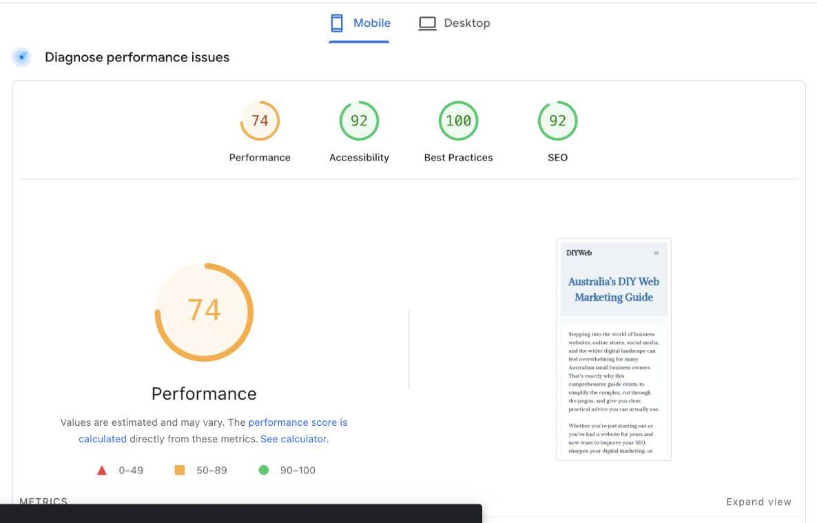
Using Google’s page speed test
This free tool from Google shows whether your site meets Google’s mobile standards and highlights any issues.
Checking your site on real devices
Testing on actual phones and tablets gives you a realistic view of how your site behaves.
Reviewing analytics to see how mobile users behave
Analytics tools show how mobile visitors interact with your site, helping you identify problem areas.
Final tips for creating a mobile friendly website design
Creating a mobile friendly website design does not require advanced skills or expensive tools. By focusing on clarity, speed and usability, you can build a site that works beautifully on any device.
Start with a responsive template, keep your layout simple and test your site regularly.
Over time, these small improvements help you create a professional, user‑friendly website that supports your business and meets the expectations of Australian customers.